Background
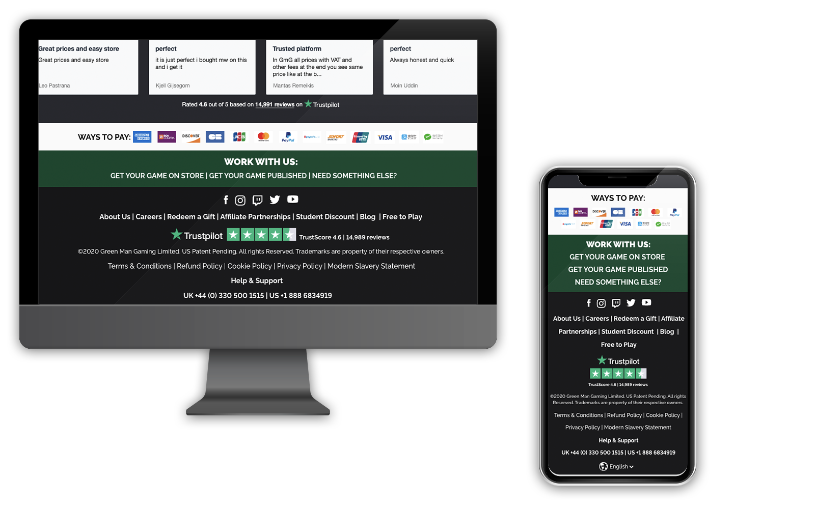
The company has chosen to enhance their mobile header for a more streamlined and efficient design that seamlessly integrates with the current system. Additionally, they decided to revamp the store's footer to align with the company's values and contemporary business approach. The previous footer fell short of modern standards and did not align with the updated brand image.
The goal
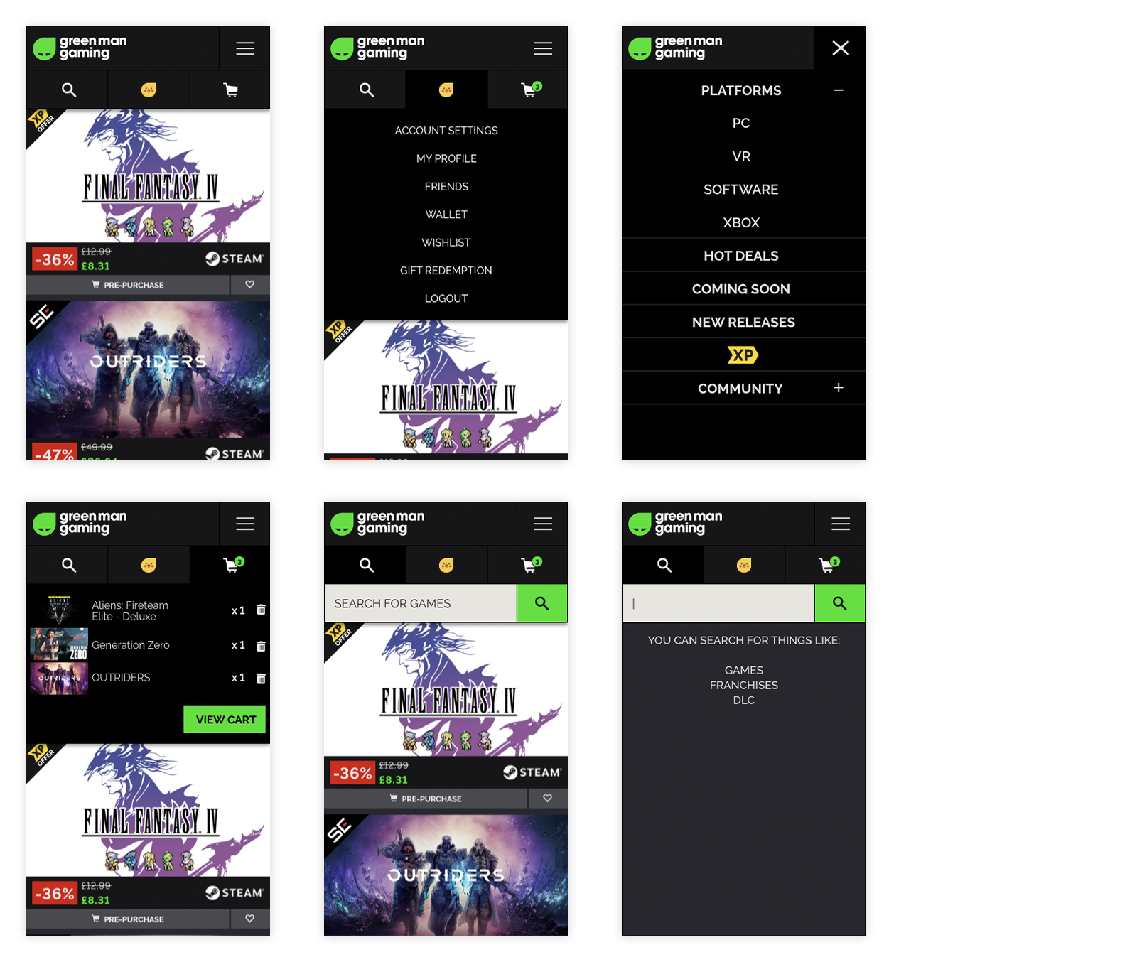
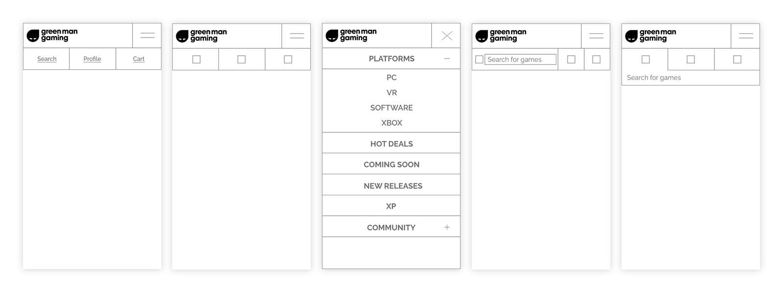
Here are the design requirements they specified:- Enable access to the global site menu control.
- Implement a dynamic cart indicator.
- Make primary header controls function like tabs.
- Remove existing features like the notification icon.
- Ensure support for graphical indicators.
The approach
Research
My process began with a thorough analysis of the current mobile header to identify its strengths and weaknesses. It became evident that the website's header structure lacked intuitiveness, primarily because it hadn't been updated and optimised for various mobile screen resolutions. The information and interaction on it was clunky resulting in bad user experience.
In response, I implemented Hotjar on relevant pages to observe user behaviour with the navigation header. Subsequently, I analysed the collected data, identifying the key user needs and prioritised them.
I also analysed the existing footer and figured out what was and wasn’t working. It turned out that the structure and information on the footer weren’t very intuitive or useful to the user. I began with research on what essential information a footer should contain.
Design
Following that, I moved on to creating wireframes and mockups, with a focus on presenting essential information to the user. The new brand identity was seamlessly integrated, resulting in a more appealing and modern look and feel. Once the wireframes and designs received approval, they were handed over to the development team for implementation.